4 Ways Your Buttons Can Increase Conversion
The ‘Add-To-Cart’ or ‘Buy’ button is essential if you want to sell wine on your website. Things like the colours, size, font, and location of these buttons play a very large factor subconsciously for a website visitor and will dictate whether or not they buy from you. Below are four factors that will change your conversion rates.
Colour
The aesthetics of a button, specifically the colour, can change the conversion rate. It’s a very simple change to sell more online and we often see designers talk wineries into making the wrong choice simply because a certain button colour fits the design style guide. Don’t be fooled, the colour of buttons matters; you should look for designers that get that.
Red will raise the heart rate, yellow draws the eye quickly (which is why Amazon.com uses it) but orange is ‘said’ to be one of the most successful add to cart button colours. Research shows that an orange button increases engagement by 5%. On most sites it's enough to stand out without looking out of place. It is also the closest you can get to red without the colour subconsciously screaming warning.

Look at your site’s call to action button colours and ask yourself, why am I using this colour? Is it White, Black or Gray because the designer thought it would match the website even though those colour make it the hardest for the customer to find the buttons (yes, black isn’t a colour, it’s a shade - but it depends if you define colour from light or from pigment).
After you’ve looked at your website, take a look at KISSmetrics’s psychology of button colour infograph (the graphic above is from their post).
Placement
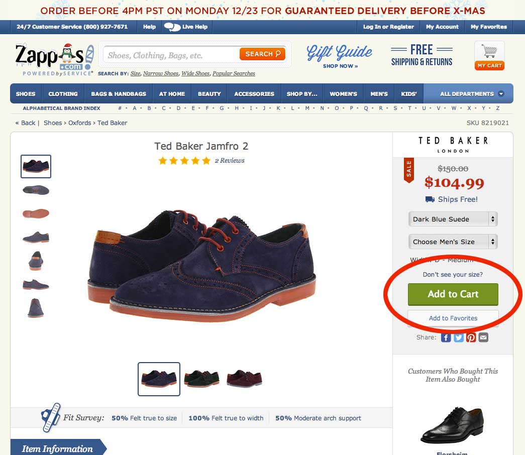
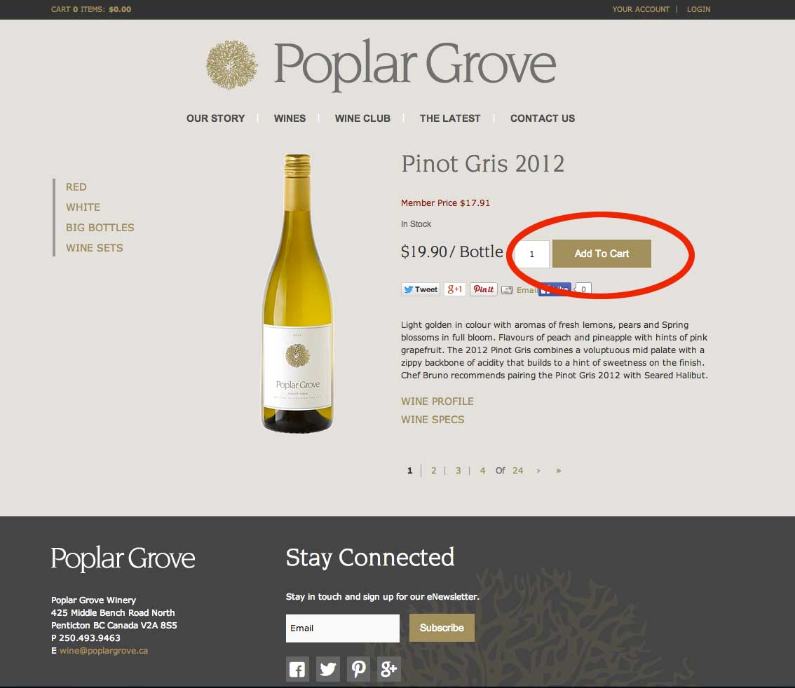
Where the button shows on a page is even more important than the colour. The button needs to be some place visible and in a predominate place on the page. It should always be above the fold (note that the fold is no longer just for desktop computers, but for mobile devices and tablets). You won’t see an ecommerce site put a button above the product, but you’ll see them put it on the right or left hand side of products.
Below are two examples, one of Zappos and Poplar Grove with the buttons on the right; both are well designed sites selling a lot online and both have the button in a location that is easy for the consumer to find.
Text
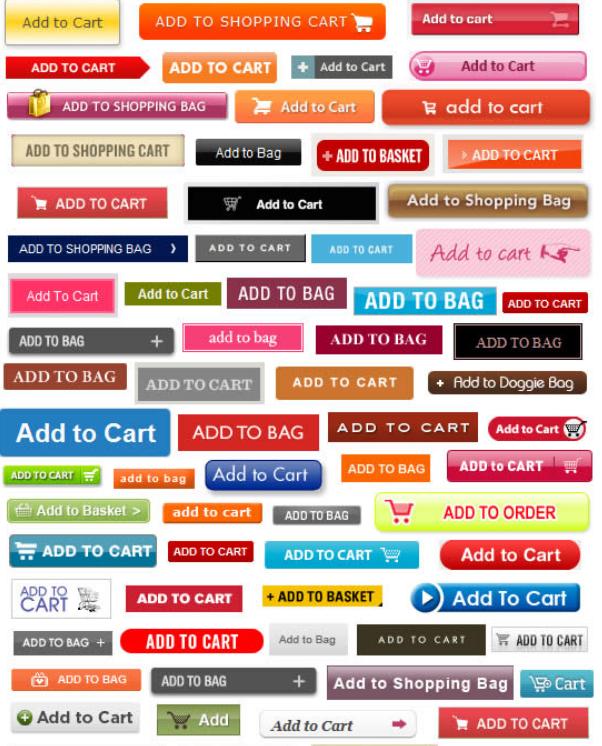
Be mindful of the buttons text. If the placement and colour are right, but the wording is bad all the other work is for nothing. Make your button stand out on your page. You want your font to be legible, clearly standing out from the button colour and using title case, not ALL CAPS (it’s much easier and faster to read). As far as what text you use, ‘Add to Cart’ has had a better track record for conversions than ‘Buy Now’ and you’ll see that most internet retailers use 'Add-To-Cart' text within their purchase buttons.
Here are some stats on the text used within the call to action/purchase buttons on over 100 top ecommerce sites (thanks to GetElastic):
 58% - Add to Cart
9.8% - Add to Bag
9.8% - Add to Shopping Bag
6.3% - Add to Basket
4.5% - Add to Shopping Cart
2.7% - Buy
1.8% - Buy Now
1.8% - Add Item(s) to Cart
0.9% - Add Item(s) to Bag
0.9% - Add to My Bag
0.9% - Add to My Brown Bag
0.9% - Add to My Shopping Cart
0.9% - Order Now
Size
Size matters.
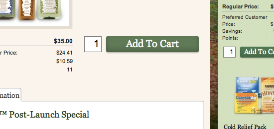
Too big and it could become counterproductive, looking out of place, or causing people to have ‘banner blindness’ which leades consumers to glaze over the call to action. Too small and it will make it hard for consumers to buy that wine.
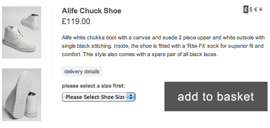
The dimensions of the button and how it compares to the other elements on the page is key. Below are examples of a good 'dimensional relationship' between buttons and the product page.
Conclusion
Your button design influences your conversion rate whether you like it or not and it’s easy to make changes. Try out a change for 3 months and see if your conversions increase. If your colour, text, placement and size are right you’ll notice the difference.