Do You Care About Your Online Customer Experience?
What experience does your website give online customers? Is it easy to navigate? Does it contain details on products for purchase? Can information be found quickly? You want to ensure that customers can easily purchase wine and have a great experience while doing it. The bottom line is that if your customers don't enjoy spending time on your website, they are less likely to visit it or spend time on it. Shopping should be enjoyable, right?
Make Your Text Readable
Remember that your site is for audiences of varying ages. You don't want people straining to read the text on your website. The truth is that if your text is too hard to read, they may just skip over it. Here are some tips for improving readability:
- Give a good amount of contrast between the background color and the text itself
- Increase the font size, but try to avoid all caps
- Don't use scripted fonts for body text, only large headings
- Give your text some room to breath with line-height
Simplify The Main Menu
Short term memory can hold only seven items at once. If your main navigation has more than that, there are too many options for your users to process at once - making it harder for them to find where they want to go. Go through your main menu, put the pages into groups that fit and try to get this number down to six or seven at the most.
When naming your pages, also be sure to make them self explanatory. For example, name your store page, 'Wines' or 'Store', not 'Experience' as it's more vague and could hold a variety of content such as wine tastings or information on visiting the winery. Keep your page names as clear as possible.
Keep Content Organised
Don't clutter your pages with unnecessary content. Keep it short and sweet. Read through your text and see if there is anything that can be cut down on. Having detailed information is great, but having too much information makes it difficult for customers to find what they are looking for.
Be sure that your content and pages are grouped in categories that make sense. Don't put your shipping information on your contact page. I know what you’re thinking - my content is well organised. It only takes a little browsing to find what you need. Remember that you need to think of that first-time customer who has never visited your website. Make sure that they can find what they're looking for without getting frustrated or having to look through every single page.
If you’re unsure, run some user tests. Give a list of tasks to a couple of people who have never visited your site before to see if they are able to find various details. If certain tasks take a while, consider reworking your website appropriately.
Do Those Buttons Right
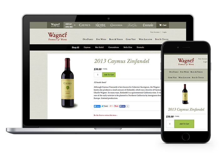
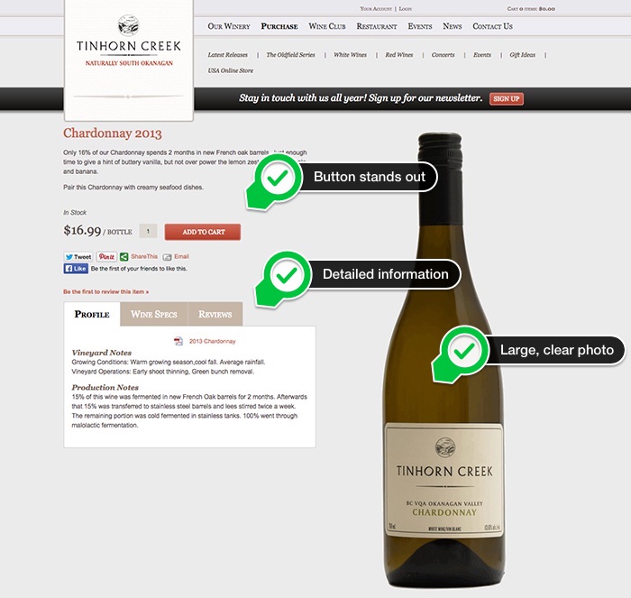
Buttons done well make a big difference. They are what guide a customer through the purchasing process. Limiting the button colors to two is important; one for primary actions such as adding a product to cart and one for secondary actions such as continuing shopping. You want the primary action buttons to stand out and draw the eye of customers so make sure that they pop and aren’t hidden on the page. Bonus points go to making them easy to click on mobile devices. Make sure that those buttons won’t take no for an answer.
Read more about how your buttons can increase conversion.
Show Off Your Products
Provide your customers with detailed product information. I don't know the last time that I purchased a product without reading up about it first. People want to know the details before making the decision to purchase.
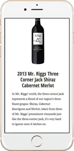
Also be sure to use hi-resolution bottle shots. These customers aren't in your cellar door, they are online. Don’t force them to choose between online convenience and in-store experience. Give them the closest experience to what they would have if they were physically holding your product. Make the images close cropped to ensure that they really stand out on your page.
How does your site measure up to the list above? Is there anything you’ve found that makes it unenjoyable or even difficult to browse and shop on a website?


