3 Easy Email Design Changes That Help Boost Response
(This is a guest blog post from Kristina Palko, Marketing Director at WineTasting.com. Kristina is responsible for an enormous amount of direct-to-consumer email and has seen first-hand what works and what doesn't.)
I create and analyze results from over 15 million wine marketing emails every year. What I've found is that email response rates vary enormously depending on audience, subject line, email content & design, and timing. It is an area in e-commerce marketing which is constantly evolving but, here are 3 easy, sure-fire ways to help increase your response.
1. Add a Top Navigation Bar to Your Email
What is it?
A top navigation or "nav" bar is the horizontal bar across the top of your website that enables customers to click through to popular product categories or pages such as home page, shop wines, join a club, visit the winery, award-winning wines, customer top rated, library selections and/or about us. Adding a similar top nav to your email is a fantastic way to improve click through rates and increase sales.
Why do it?
I have seen incremental increases as high as 100% generated from the top navigation bar within an email. It becomes a sales “catch all” in that if your primary offer is not of interest to your customer, the top nav may remind your customer of what else you have to offer.
How to apply it to email.
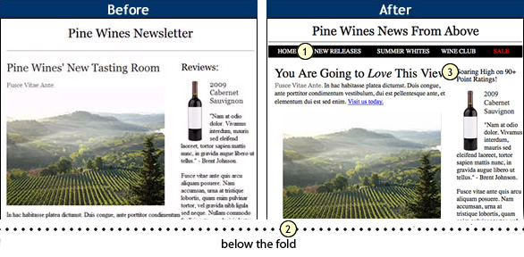
Implementing a top nav bar is simple and does not necessarily involve a designer. In fact, you can easily add a text based top nav by inserting a table with 1 row and 4-5 columns just under your main header or logo. If you have a designer, you can ask him/her to create a graphic and use hotspots to link the corresponding surface area to the correct landing page however, a text based version will function just as well.

A quick example illustrating how these 3 principles were applied.
2) Design "Above the Fold"
What is it?
The term "above the fold" means the email creative that falls within view without scrolling down. This space generally varies based on email programs and screen size. My advice is to design so that your sales message is fully visible within about 600 pixels or about the size of your hand (fingers together) if turned horizontally.
How to apply it to email.
Simple. When you are designing or writing your email, be sure that your core message is visible "above the fold". Some believe that the fold theory is outdated and that people have learned to scroll. This is certainly true thanks to our interactive phones and tablets, however, whether customers scroll when it comes to your email depends on 1) How engaged the consumer is with your products/brand and 2) How much time they have. Either way, getting your offer across in a couple of seconds without additional scrolling is never a bad thing.
Why do it?
So that your offer is fully optimized ensuring the highest degree of communication possible.
3) Infuse Your Unique Brand Personality Into Subject Lines, Titles & Buttons.
What is it?
Say the same thing…but differently. If it sounds like an oxymoron, it is. The fact of the matter is that many of us employ the same cookie-cutter methods such as ratings and reviews, tasting room, new releases, etc to drive awareness and increase sales for our brands. But, how often do we really think about what we are saying and how we might say it just a little differently for maximum impact? There are three areas of any campaign where you can maximize your message:
- Subject line. If they never open it, they’ll never get your message.
- Titles & Subtitles. Think of this area as you would in an advertising campaign – this is where you want to make maximum impact in a few short words.
- Call to Action button. The one click that matters. Get them to your product page quickly and directly.
How to apply it.
There are three impactful areas of any email campaign that benefit the most from this principle. Here are some examples of how I have effectively used them in some of my own campaigns.
Email 1: Valentines Day email featuring eco.love wine
Subject line: Share the Bottle-ly Love"
Title: …eco.love Wine That Is!
Subtitle: Two sisters reunite as adults to share their passion for winemaking and the environment. A true love story.
Call to Action Button: Share the Love
Email 2: Buoncrstiani Rose’ offer
Subject line: Real Men Drink Pink Wine
Title: Who Said Pink is For Girls?
Subtitle: The Buoncristiani brothers have been hand crafting Rose’ since 1999.
Call to Action Button: Go Pink
Why do it?
Greater engagement. And think of it this way, even if it doesn't result in a sale, it likely resulted in an extra moment of consideration and your customer will be more apt to open your email next time…and that is always a good thing.
Re-examine your wine email marketing designs, test these strategies and compare your response rates to those of your current campaigns. Infuse your brand's personality into your call-to-actions. These simple changes may lead to more sales and increased engagement that will lead to more sales in the future.
|
Kristina Palko was born and raised in Napa Valley. She is currently the Marketing Director at Winetasting.com sending and monitoring over 1 million emails a month. Kristina has over 10 years of experience in wine industry online marketing. She also enjoys photographing dogs and has a beautiful German Shepherd named Kato. |
Missing Component