5 Wineries/Wine Retailers that 'Get' the Web
It's fairly easy to pick apart websites and list everything that is being done wrong from an ecommerce perspective (and some of my recent posts have done that) but there are a lot of wineries and wine retailers that are doing it right (both on our platform, and on other platforms). Today as I was browsing through our portfolio, I wanted to highlight a few websites that are doing it right.
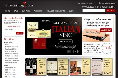
WineTasting.com
What I like about WineTasting.com:
- The large phone number in the header, the links to customer service, and the feedback forms on the website make it really easy for customers to contact them.
- The prominent subscribe form on the left hand navigation is a great way to build the emailing list.
- The mobile version of their website is easy to navigate. While a large number of wine retailers don't have mobile sites, WineTasting.com has fully embraced mobile. (Chris Edwards the VP of WTN will be speaking at this upcoming mobile conference). A demo of their mobile site can be found here.
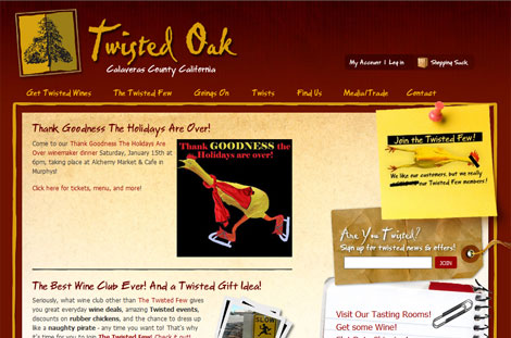
Twisted Oak
What I like about TwistedOak.com:
- While you can debate some of the wackiness, the customized content on this site is fun to read. How many wineries have a 'Find Us from Space' page on their website?
- I like the prominent subscribe form on the right hand side of the homepage - a great way to capture email addresses.
- Similar to WineTasting.com, I like the mobile site. It's great to see wineries offering mobile versions of their site. (The mobile site represents almost 10% of Twisted Oak's total web traffic).
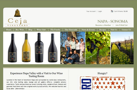
Ceja Vineyards
What I like about CejaVineyards.com:
- The commitment to blog and all the videos on the blog on this site is great. Video content does sell more products. I also love that there are a number of members from the Ceja team contributing content and video to the blog (it shows a team commitment).
- Social media is everywhere on this site. The product list pages and product drilldown feature Facebook, Twitter and other social media.
- The bottle shots on this site are clean, crisp and clear (sure they aren't the size of bottle shots on sites like Inman Family, but the bottle shots are professionally done).
Site designed by BR Pacific
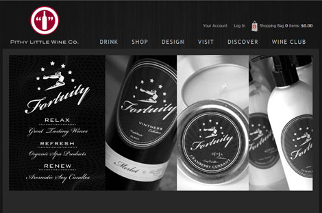
Pithy Little Wine Co
Pithy Wine gets it. Before we had an iPad app, they bought iPads for their tasting room and used their website on the iPad to collect visitor information.
What I like about PithyWine.com:
- I like that the site was designed by the winery themselves. It's great to see creativity right from the winery.
- I like that they have multiple product photos for each wine. Great bottle shots, picture of the back labels, front labels, etc. (Check out the 3 photos on this product here.) You should not underestimate good photography.
- I like that the site stays fresh and current. A few weeks ago they had holiday pictures on the homepage, and when I went back today they already had changed the homepage with new content. It's great to see freshness.
Site designed by Pithy Wine
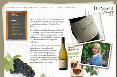
Inman Family Wine
What I like about InmanFamilyWines.com
- Not all the product pages on this site are the same, but I really like the detail on product pages like this. I like how they link to recipes and vineyard notes for the product.
- The commitment to simple and easy to understand shipping rates for customers is excellent. The shipping widget (left hand side of the page in the 'Wine Shop') is a great way to show upfront shipping.
Site designed by Sight Design
~~
Over the last few years we have seen a lot of wineries and wine retailers increase their efforts on the web. There are a lot of great sites both on our platform and on other platforms. (If your site isn't listed above, it's not because I don't like it.) Keep raising the bar.
